Behind the works
2026 – Now
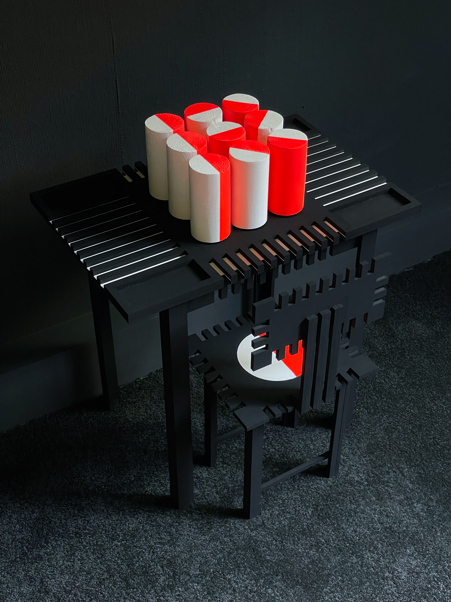
Reading Facets
Reading Facets is part of the ongoing research-based art project by Rob Stolte that explores the relationship between language, perception and material resistance. The works are made from sheet glass, acrylic paint and black sealant, and appear as crystalline structures in various scales. They are readable objects, although their legibility is learned rather than given. Meaning appears through the relation between faces, angles, colour, transparency and orientation.
The works draw on Friedrich Fröbel, the nineteenth-century educator who understood play as a way of thinking through materials. Before Fröbel developed his pedagogical system, he worked with mineralogical and crystalline forms. This earlier attention to natural order becomes key to understanding Fröbel’s later concern with form, repetition and transformation.
Stolte connects this pre-pedagogical ground to his own research into readable forms as constructed systems of perception. His system of nine circles is translated into a crystalline form with nine faces. These faces do not simply decorate the object; they form a grammar. Each plane, edge and colour field becomes part of a rule-based structure through which the object can be decoded. The result resembles a natural object, but its structure is synthetic. It does not grow from nature; it is constructed as a readable system.
A crystal reveals its inner order through its surface: smooth, reflective planes that catch light while keeping the hand outside. This tension returns in the glass surfaces of our communication devices. Screens also promise clarity through smoothness. Language, images and knowledge appear instantly, with almost no physical resistance. We touch everything in the same way, and this changes how we read, learn and judge. When information arrives without friction, it becomes easier to accept and harder to question. Complexity is flattened into fragments, abbreviations and icons, while letterforms increasingly function as neutral carriers of information. Resistance matters because it slows perception down. It asks the viewer to stay with an object, to test assumptions, and to discover that understanding is not the same as access.
In Reading Facets, the object interrupts instant recognition. It has to be decoded, unfolded and mentally reconstructed. Reading becomes an active process in which the viewer learns the grammar through which form becomes sign, and sign becomes language.
2025 – Now
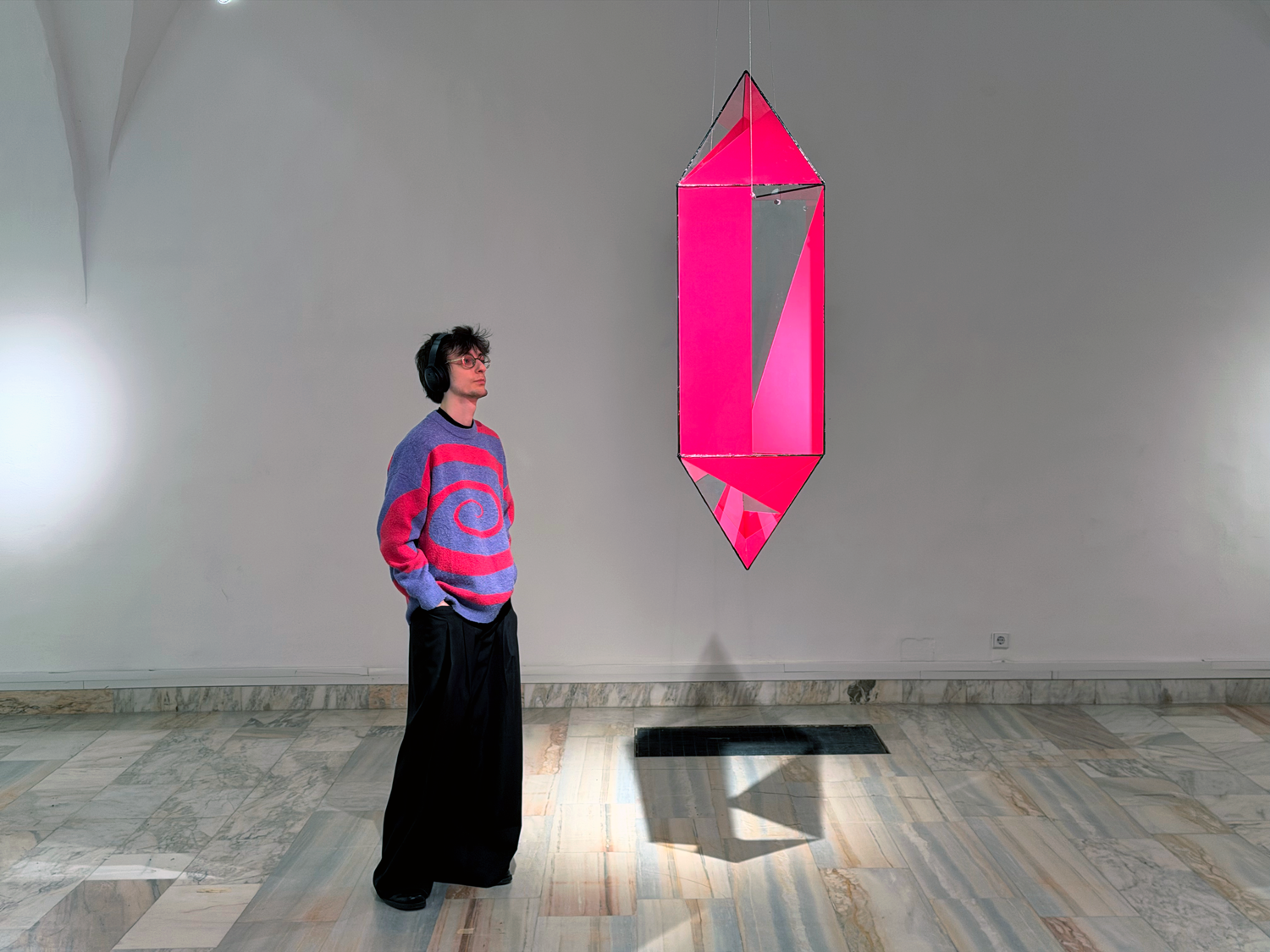
Proto–Futura
Proto–Futura is an ongoing research-based art project by Rob Stolte that explores the speculative futures of writing through its ancient origins. Drawing from early proto-alphabetic inscriptions carved in the turquoise mines of Serabit el-Khadim, the project reimagines script as a cultural practice rooted in sensory experience, intuition, and collective meaning-making.
In an immersive, participatory installation, visitors carve new, non-alphabetic signs into physical surfaces, liberated from conventional language systems. These intuitive gestures are documented and analyzed, forming a living archive of contemporary symbolic expression.
Bridging media archaeology and inclusive literacy, Proto–Futura investigates how writing might evolve beyond standardization and toward forms of communication that embrace neurodiversity, a re-connection between sound and symbol and post-technological embodiment.
2024 – Now
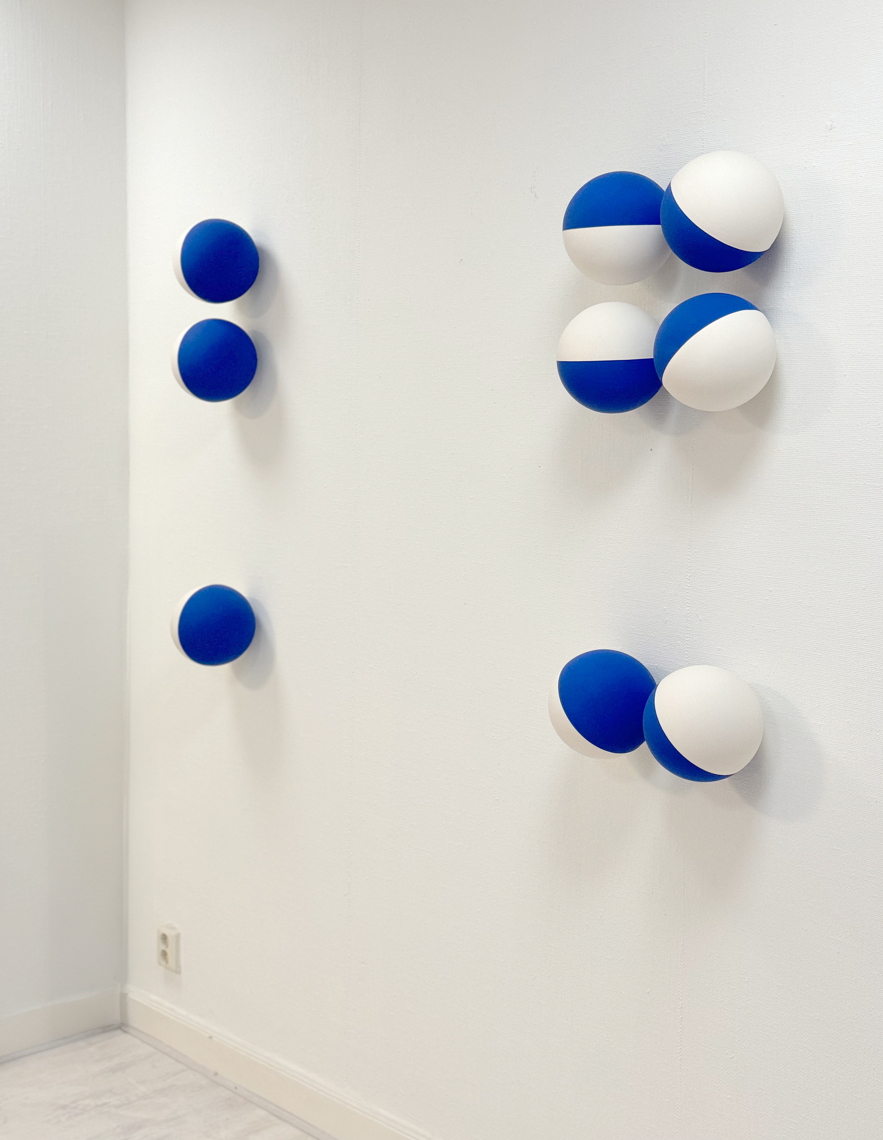
The Stroke
In The Stroke, Rob Stolte plays with the perception of literacy by combining nine spheres into different configurations. As a constellation, all nine spheres are arranged in a precise grid on a wall, allowing the letter to emerge to the viewer at a single glance. The nine isolated spheres are sold separately and spread across various geographical locations, making the letter visible only when the spheres are properly investigated and assembled. The work raises the question: how does the meaning of something change when it is not immediately accessible? How does the space between the spheres affect the way we recognize meaning?
The works engage with how we perceive: directly as a complete image or indirectly through systematic analysis. Both reflect humanity’s history of communication, from early, immediate, flat drawings on cave walls to linear letters that represent chronology and time. In this process, Stolte refers to the tension between line and plane—tension that profoundly influences the perception of letter recognition. When you focus on the line, the plane disappears; when you perceive the plane, the line becomes invisible. This interplay challenges the viewer to shift between two perspectives: the letter as an optical unity, and the separate parts that form this unity when correctly positioned. The work illustrates how we construct meaning: in one phase, immediately and holistically; in another, step by step and analytically.
Through this play of visible and invisible meanings, Stolte explores how our perception depends on distance, proximity, and accessibility. In the constellation, the letter is directly present, but once the spheres are dispersed, the experience changes. The viewer must engage in the process of assembling and organizing, thereby unlocking the hidden meaning. The Stroke emphasizes the dynamic interplay between the visible and the invisible, the immediate recognition and the patient investigation, reflecting the power of language itself—in this case, depending on the perception of the viewer.
2022 – Now
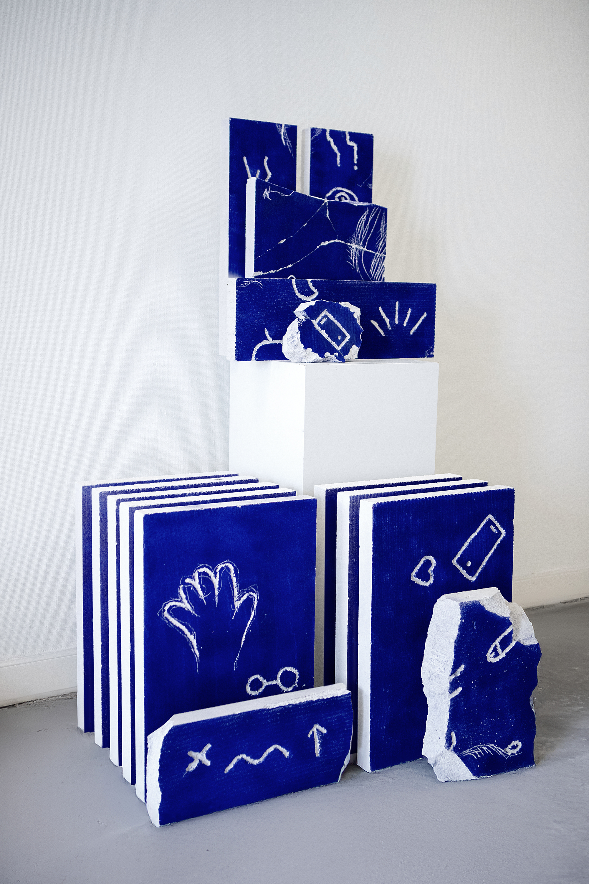
A Pre-Literate Playground: bridging the gap between illiterate and literate life
In 'A pre-literate playground', Stolte reflects on the period before he learned to write. Growing up, his mother always encouraged him to ‘fröbel’. He thought it was just a saying and always considered it an enjoyable, but thoughtless pastime. When researching his pre-school period, Stolte learned that Fröbelen is actually a term used to describe the educational philosophy and methods of Friedrich Fröbel, who was a German educator and proponent of early childhood education. Fröbel believed that education should focus on play and exploration.
Fröbel developped serval ‘gifts’, like the building block set. These materials were intended to provide children with a variety of sensory and intellectual experiences that would stimulate their curiosity, creativity, and critical thinking. Letters are not included in the "gifts" because Fröbel believed that formal education and instruction in reading and writing should not begin until the child was at least six years old. It made Stolte wonder if there is a way to introduce letters in the gifts of Fröbel, easing the transition to literate life.
Building on Fröbel's ideas in an effort to bridge play and academic learning, Stolte exchanges the rules of language that hinder him for his own rules of the letter system. In this series of works, that system has been reduced to its essence: the minimal grid of 3 by 3. At this level of abstraction, letters are barely recognizable and forming and considering letters becomes intuitive. It is a personal process of symbol formation and it invites the viewer to experiment with different arrangements and configurations and to use their imagination and creativity to create unique and interesting letter compositions. 'A pre-literate playground' is an ongoing visual research that results in dialogical typographic objects.
2018 - 2022
GLYPHS: niche parfums based on the historical origin of the Latin alphabet
“Everyone who can write must know the origin of our alphabet,” says artist Rob Stolte. When Stolte grew up, he had difficulty reading and writing. He would rather draw something than write it down. It frustrated him and he started to wonder where the shape of letters comes from.
When Stolte discovered that letters are abstract images, this all changed. Take the historical origin of our letter A, for example: it is actually the head of an ox. Turn the letter A upside down and you can still see the horns and head. Stolte realized that the way a word is displayed can convey much more than just the letters. “It offered me the opportunity to turn my weakness into a strength: express myself through typographic images and letters,” says Stolte.
It made Stolte wonder if our alphabet could be transferred in other - sensible - ways. Wouldn't it be exciting to smell a story? Or to 'read' by eating? Through these experiments, writing and reading enter the realm of intuition, memory and new ways to use our senses to make connections that enable us to communicate. It resulted in Stolte's believe that a more inclusive handling of our alphabet is possible through synesthetical approach.
This fact was the startingpoint for the creation of the perfumes (together with masterperfumer Mark Buxton and David Chieze). Since the first alphabet was carved in stone, the name GLYPHS was given to the project. It means 'to engrave, to carve'. “Now we know where our letters come from, we also know how they smell,” says Stolte. “For the first time in history we can create a scent-based writing system of the alphabet.”
2016-2018
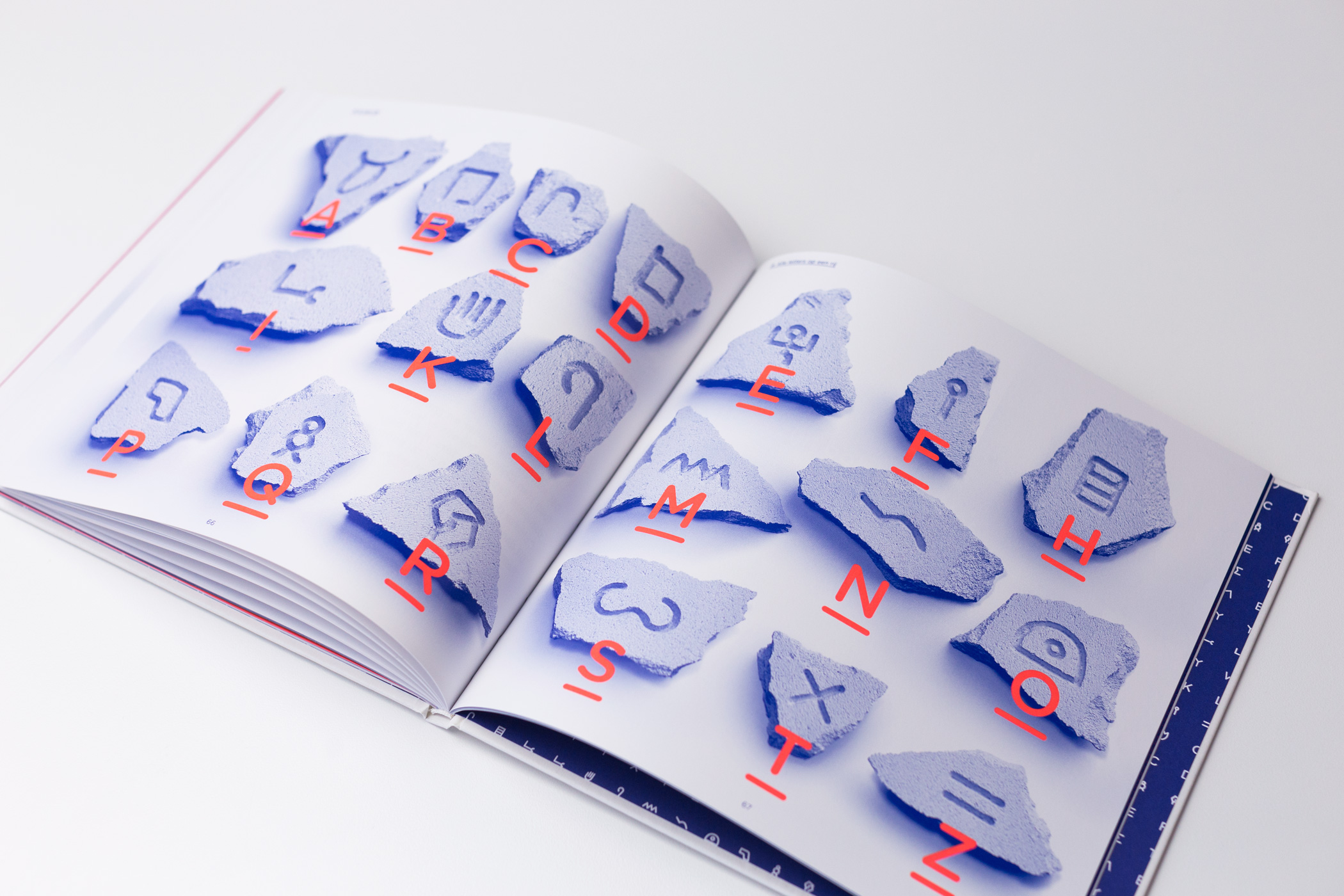
A is for Ox: a visual approach to the development of the Latin alphabet
Pjotr van Lenteren gave a five star review in Volkskrant magazine:
A is not at all for ‘apple’, but for ‘ox’. Most pre-university students know this. But what about the other eighteen letters that form the basis of our alphabet through Greek and Latin? The D is from ‘door’. The E of ‘Hey, you there!’, the L is a rope to tie the donkey to a post and the M is for ‘water’. Just look, then you’ll see it.
To immediately remove the impression that A is for Ox, from the writer Bette Westera and visual artist Rob Stolte, only exists for prospective scientists: that is not the case. Stolte found an ingenious way to visualise the letter evolution from Proto-Sinaitic to Greek and Latin. By dividing each letter into two parts, the one pink and the other colored blue, the development through thousands of years of writing history can easily be traced back.
Once you have seen the little arms of the person who calls ‘Hey you there’, you will always recognize them in the E. And the H is of course a ‘fence’, what could it be otherwise? Westera tells a micro-story of one sentence accompanying each letter. About caravans and deserts, rivers that bring fertile silt, oxen that help to plough the tough clay, pins that help keep a tent upright. Thus each letter represents a case that was of vital importance in ancient times.
There is no big difference, says Stolte, between the origin of letters and the pictures people use today to express what they find important when they use emjoi's in Whatsapp. The story of our alphabet has been told and shown more often. But rarely as inspiring as here.
A is for Ox is translated to French and Simplified Chinese. The publication is awarded with a Golden European Design award, an 'A Design award and a Certificate of Typographic Excellence by the Type Directors Club New York.
Product photography: © The book photographer